
Apple is launching its first foldable iPhone. Whilst your app may work on it without any modifications, the question is whether it will make full use of its potential. What do you need to check to ensure your app adapts to the larger display, remains easy to use and delivers real benefits to users?
Your existing iOS app will run on the iPhone Duo without any changes. The question is whether it will make good use of the larger display and remain easy to use when the phone is unfolded. Before planning support, you need to understand two things: what needs fixing and where the extra screen space will genuinely benefit users.
Duo is Apple's first foldable iPhone, due to go on sale on 23 October 2026. When folded, it uses the outer display. When unfolded, it offers a larger inner display, and it can also remain partially folded. The inner display allows users to run two apps side by side. This means your app has to work with different amounts of screen space, even within a single task.
Will my app work?
Yes. However, on an unfolded phone, the system will display an older version of your app in a smaller window, with empty space around it. Users will see an interface roughly the size of a regular iPhone screen, despite having a much larger display available.
A build using the iOS 27 SDK allows your app to adapt to the display size. Full-display support, including the areas alongside the system interface elements, is only available with the iOS 27.1 SDK. But that does not mean the work is done. If your screens have fixed dimensions, a new build will not fix them automatically. When the phone is unfolded, for example, content may stretch in unintended ways or parts of a form may end up outside the available area.
Empty space around an older app and a broken layout are two different problems. The first relates to how the system displays an older version. The second requires changes to the screen itself. During the assessment, your team needs to distinguish between the two.
What should you check?
Start with the tasks that matter most in your app, such as making a purchase, logging in, searching or working with a document. For each one, check the following:
- Does all the necessary content fit on screen? Text, fields and buttons must remain usable whether the phone is folded or unfolded.
- Can users complete the task with less screen space? When two apps are displayed side by side, yours no longer has the entire display available.
- Is the user's progress preserved? Unfolding the phone must not cause a completed form, selected filters or an open detail view to be lost.
- Are key buttons still accessible? Check this when the phone is partially folded and when your app is displayed on either side of the screen.
If your app currently only works in portrait orientation, ask the team to assess wider layouts as well. Make sure to test with larger text sizes, too.
What affects the scope of work?
The amount of work also depends on how the interface is built. Apple's standard navigation and control components already support the new layout. Custom navigation bars and buttons need to be checked separately.
When preparing apps for Liquid Glass in 2025, we encountered disappearing button labels and issues with custom icon backgrounds. That experience showed us that custom controls need to be checked individually after a system update. Duo also changes the position and arrangement of navigation elements. For custom bars and buttons, we therefore check not only how they look, but also whether they remain accessible in the new layout.
Native or cross-platform app? What matters is which parts use Apple's system components and which are rendered by the app itself. With Flutter, React Native or Compose Multiplatform, you also need to verify support in the versions of the framework and libraries you use. The technology alone will not tell you how much work is involved.
Where does the larger display make a difference?
The biggest benefit comes when users currently have to switch between related pieces of information. Here are a few examples from financial apps:
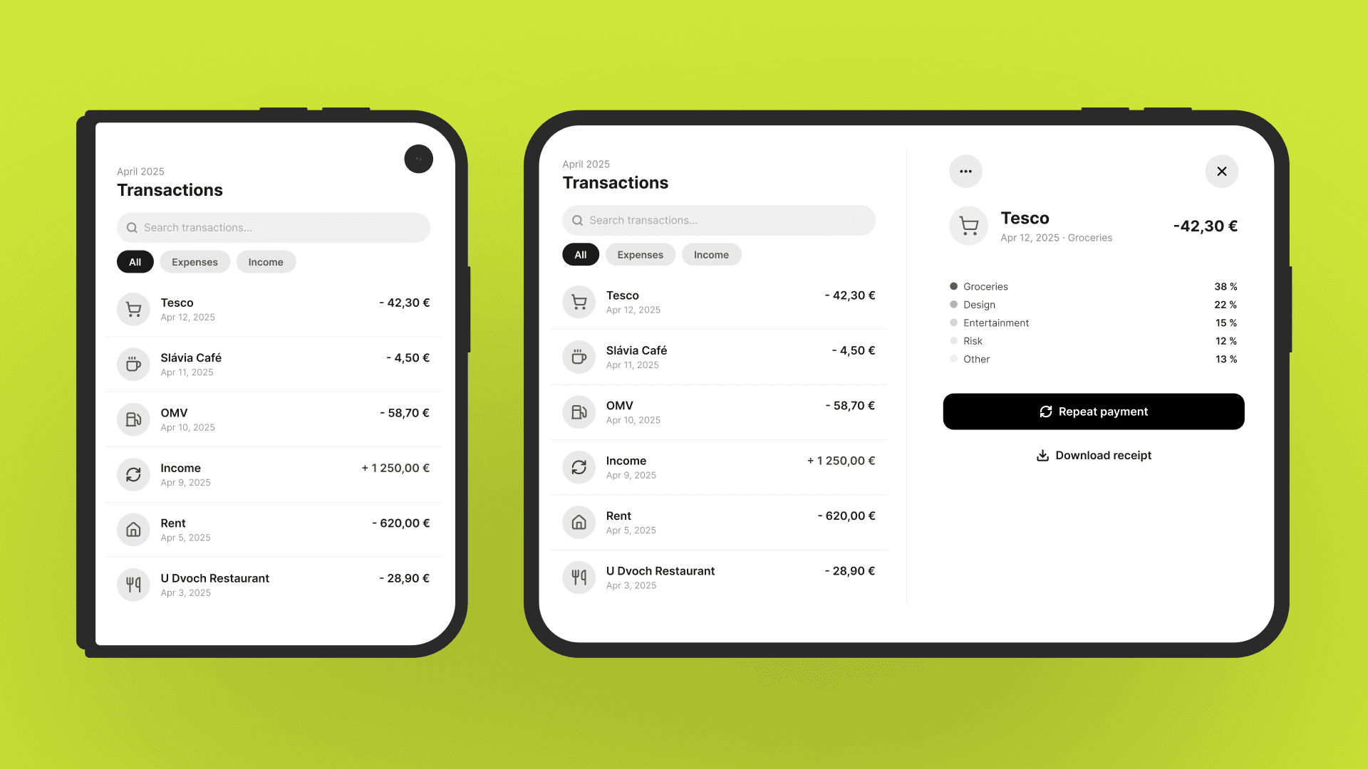
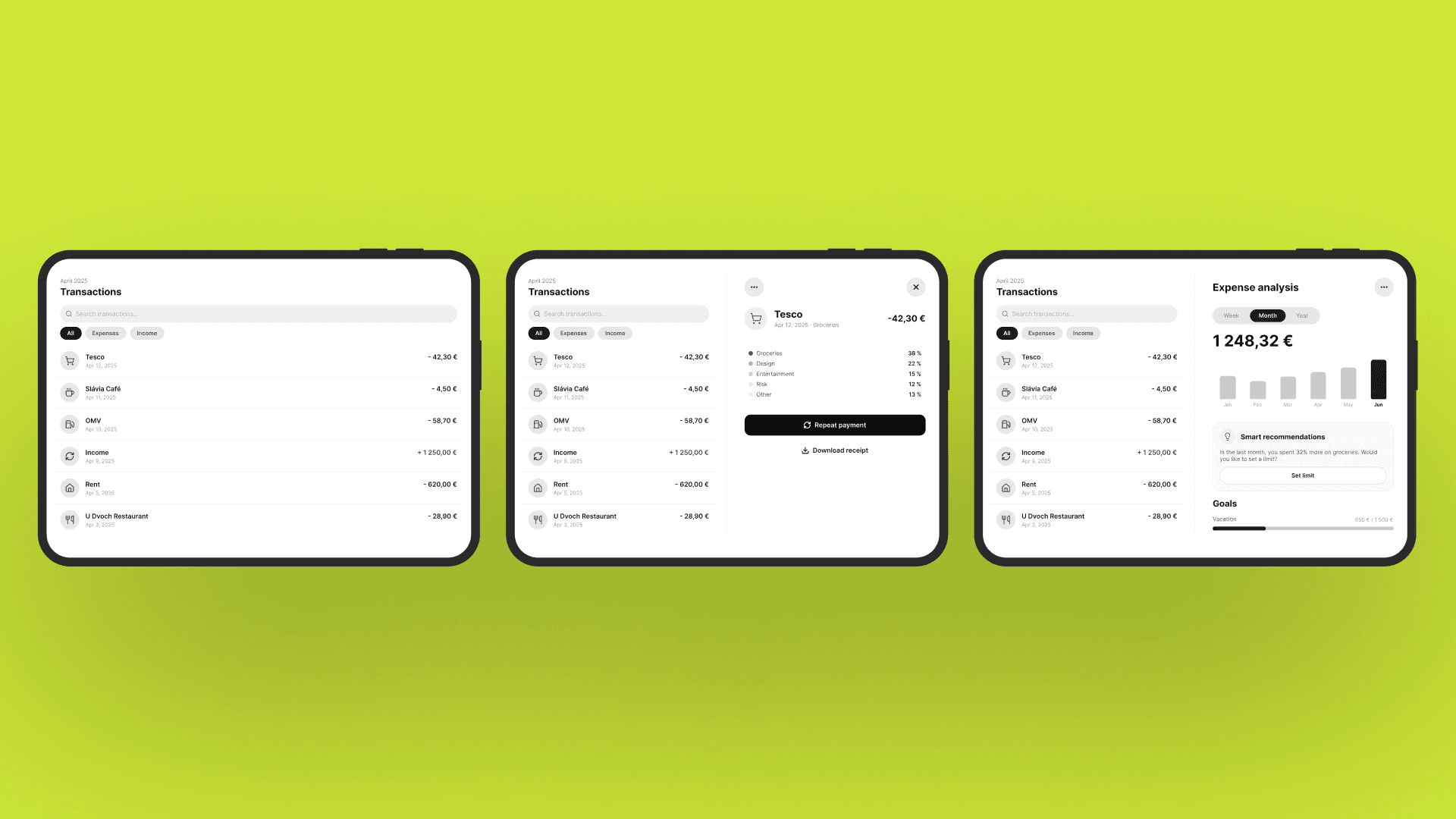
- Reviewing payments: Users can see a transaction list and the details of a selected payment side by side. When looking for a particular payment, they no longer need to return to the list every time they open a transaction.
- Reviewing spending: Users can see their spending categories alongside the payments within a selected category. They can immediately see which purchases make up, for example, their monthly grocery spending.
- Comparing loan offers: Users can compare the monthly repayment, fees and total amount payable for two offers side by side. They do not have to memorise the figures while switching between them.
When confirming a payment, however, clear information and an obvious confirmation button matter more. Simply stretching a form across the entire display will not make the experience any better.
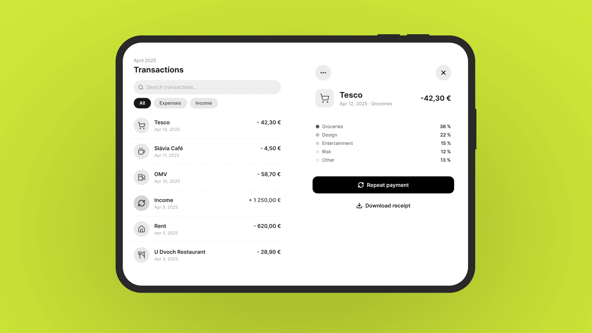
The product team also needs to decide what remains visible when less screen space is available. When reviewing a payment, the amount, recipient and payment status should take priority. The option to repeat a payment could remain accessible through a menu. However, if a user is dealing with a payment issue, they need an easy way to contact support or raise a dispute.
Your requirements should therefore cover not just the wider screen, but also how the app behaves when space is limited: what remains directly accessible, what moves into a menu and how users continue a task they have already started. For example, a list and its detail view could appear side by side on the larger display and sequentially on the smaller one, without introducing two separate navigation systems.
What does this mean for your budget and release plan?
After the assessment, divide the work into three categories:
- Fixes: Inaccessible buttons, clipped content or lost input. Prioritise these according to the severity and frequency of each issue.
- Improvements to the existing interface: For example, displaying a transaction list alongside the details of a selected payment. Consider how often people perform the task, how the change will help them and how much work it requires.
- New features: For example, an enhanced comparison tool. These need their own validation of user interest and an estimate of ongoing maintenance costs.
Adjust the investment to reflect how many of your users have a Duo and what tasks they perform on it. Until you have this data, treat estimated interest as an assumption rather than confirmed demand.
Remember to include testing in your estimate. If you change shared screens or navigation, you need to verify that they still work on standard iPhones and on older supported versions of iOS.
You should also plan your App Store screenshots. According to Apple's announcement of 5 October 2026, these will be required when submitting apps and games to App Store Connect from April 2027. Your development team can find the technical preparation steps in Apple's iPhone Duo guide.
Before your next planning session, ask the team for the results of its assessment of key user journeys, along with separate estimates for fixes and improvements. This will help you decide what belongs in the next release and what should only be added to the roadmap once its value has been validated.