Frontend • Design • 7 Mins reading
Practical guide to visual accessibility
Andrej Nemeček4 Sep 2025
Are you considering a career in design? Then you are in the right place! During the three-month design bootcamp, I gained a lot of valuable knowledge and advice that I want to share with you. I believe that my experience and advice can help you succeed.

I've had GoodRequest in my crosshair for a long time and I've always liked their Academy concept, where they give students and young talents a chance to shine. Unfortunately for me, until now academies were opened only for iOS and Backend developers, but that changed last year and the first GoodRequest Design Academy was born. I did not hesitate and immediately sent the application. Let's take a look at how I got into Bootcamp, how it went and what I took away from it.
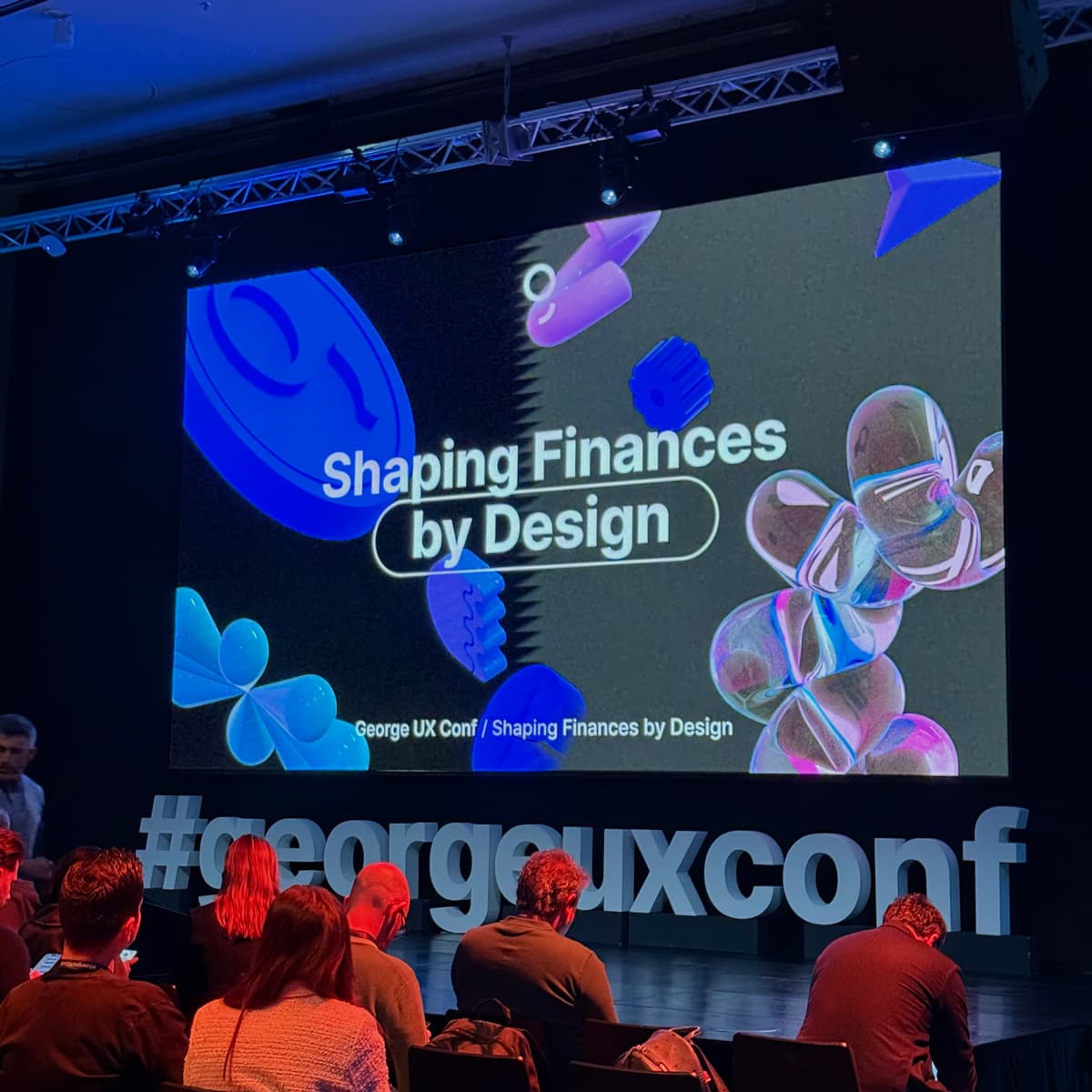
The first round of the selection process was a homework assignment. After filling out the application, I received an email with an assignment that I had to complete within 1 week. It was about the design of a mobile app for managing finances. The goal of this app was to help users better understand where their money is going, motivate them to better manage it and help them save money.
Designing an app in a week was quite a challenge for me, but since I just had a vacation, I tried to use this time as efficiently as I could. I used the Design Thinking method when designing the application. First, I did some research on the issue, read a few articles and got a little familiar with the topic. In this section, I have searched for various ways, tips and tricks that can help people save money. I focused on these three:
Since there was no space for any larger research, I conducted a few interviews with friends who could be affected by this issue during the week. Based on research and interviews, I defined the key features of the application. Finally, I drew the app and created a clickable prototype.
My app looked like this at the end of the week:

After completing the assignment and a successful interview, I was notified that I was accepted and we agreed on a starting date. I couldn't wait! 🤩
On my first day, we arrived at the GoodRequest office in Žilina, where our joint onboarding began. After the initial onboarding, we received the equipment, a swag bag and got to know the designers, with whom we later went for lunch together. It was great to get to know my colleagues in person and have a little talk. After lunch, we continued with the onboarding to the Design team, where we went through the design process, team ceremonies and everything that awaits us in the coming weeks.
The next day we all met at the initial kick-off meeting. Here we were presented with an assignment that we had been working on throughout the academy. The design team prepared for us the design of a new digital product, specifically a web application for creating questionnaires.
We had divided the work on the assignment into individual phases. At the beginning of each phase, we had a theory ready, which we had to study and make notes in Notion. There we wrote all the notes and worked out all the assignments during the Academy. I love the concept! I've been using it for a long time for absolutely everything to do with notes and planning, so I was excited to be using it in the academy as well.
Interesting things from the articles and things that were not clear to us were discussed together every day in a discussion group at the morning standup. There we discussed everything we managed to do the previous day, whether we had a problem with something and how we would continue.
These standups were my favorite part because when we got stuck somewhere, we solved it together very quickly and were able to move on.
We started the work on the assignment with market research and competition analysis. The goal of this phase was to familiarize ourselves with the industry and to be inspired by good solutions from other, similar tools.
We started with a desk survey in which we collected as much relevant information as possible that was already available on the Internet. In this step, we investigated basic information about questionnaire tools, how they work, what can be done in them and how they are used. We focused on the TOP 5 competitive tools on the market and identified their strengths and weaknesses. We explored their features and tried to find what makes them stand out from other tools, their Unique Selling Proposition.
It was only here that we found out how complex some tools can be and how deep we can go. We also realized how big our competition is and that if we want to create a product that is supposed to be competitive, it will not be so easy.
The output of this phase was the presentation of all our findings.


💡 Key Takeaway #1: JIt is very important to have an overview of the market and to know your competition. In this way, we avoid creating a product that has no place on the market and we can save a lot of money.
💡 Key Takeaway #2: A successful product is created if it is designed at the intersection of desirability, viability and feasibility.
Once we had familiarized ourselves with the questionnaire tools, we took a closer look at the users of these tools. In this section, we found out how our users behave, for what purposes they use questionnaire tools and what experiences they have with them at work.
Our main activity in this phase was qualitative research, in which we conducted in-depth interviews with users of questionnaire tools. At the beginning, we defined the objectives of the research and the hypotheses that we wanted to confirm or refute. Based on our objectives, we put together questions and created a script to conduct the interviews. At the end, we contacted the respondents and conducted the interviews.
This phase lasted a little longer than the others. I had the least experience in this area and the most room for improvement, so I was glad we spent more time on it. What I liked most was that we could try conducting in-depth conversations on our own skin. It was a bit out of my comfort zone for me, but I learned all the more.
The output from this phase was a report of our findings from the interviews, recommendations for design and a presentation.


💡 Key Takeaway #1: Empathy is essential for UX design. It helps us empathize with the situation of our users and their problems. The better we know our users and their behavior, the better we can design for them.
💡 Key Takeaway #2: We do User Research from 2 perspectives. Qualitative findings help us understand the user and their behavior. An example of qualitative research is in-depth interviews. Quantitative data validates, extends and prioritizes findings. An example of a quantitative survey is, for example, a questionnaire.
After synthesizing the data we got from the interviews, we looked at the outputs and tried to find patterns in user behavior. The goal of this phase was mainly to identify the key problems of the users, find something that bothers them and see how we solve it.
The first output from this phase was the Journey Map, which depicted user behavior, their problems and emotions in individual parts of the interaction with the tool.
It was not easy to get so much information in one picture, but the result was worth it. This way we had all the data in one place, which helped us see all the problems and find opportunities for improvement. When I saw it all together, I was surprised at how much data we can get from just a few conversations with users.


From the information we read from our map, we created user need statements that reflected the main problems, needs and goals of our users. These served us as an entry to the Ideation Workshop, which was prepared for us by our Researcher Damián.
The first activity in the workshop was problem prioritization using the MoSCoW method. Once we knew which problems to focus on, we let our creativity run wild and tried to come up with as many solutions as possible to these problems using the Brainwriting technique. It was interesting to see that everyone approached the problem a little differently and came up with different solutions. Nevertheless, some solutions were related, so we grouped them according to similarity using the Affinity Diagraming technique. Finally, we ranked these groups of ideas according to their design value. Based on this, we decided which functions would be part of our MVP.
The workshop was not only beneficial for the next stages of our assignment, but also fun. It was great to try live all those ideation methods that I had only read about in articles so far and apply them to our project.

💡 Key Takeaway #1:
It is very important to define the problem we are going to solve and make sure we are solving the right problem. In this way, we prevent the creation of a product that does not solve any of the users' problems and thus brings almost no value to them.💡 Key Takeaway #2: User need statements help us see user needs as real-world problems instead of specific features.
At the end of the academy, we devoted ourselves to probably the most fun part, namely the creation of wireframes and the UI design of our application. We finally went to draw! 🥳 At the beginning of this phase, we had a short introduction to Figma from our Designer Peć, who showed us more advanced Figma functions such as working with components, constraints and auto layout. Even though I was familiar with these features, I was surprised by all the ways they can be used and how much they can make our design work easier.
Even before we dived into drawing the screens, we drew the User Flows. These represented different user journeys in the application, which helped us later when drawing the screens. We drew wireframes and created a clickable prototype of the application, which we tested with users. We incorporated the observations from testing into our design. We regularly received feedback while drawing, which helped me a lot when I got stuck somewhere and couldn't move on.
In this phase, I mainly learned to think like a developer. While creating the individual components in Figma, I thought about whether what I was drawing was feasible and how it could be programmed. The Auto Layout function in Figma, which simulates the functioning of flexbox in CSS language, helped me the most in this.
The final output from the academy was a functional, clickable prototype of an application for creating questionnaires.


💡 Key Takeaway: Creating components and styles in Figma may slow us down a bit at the beginning of the project, but later on we will work better, faster and our design will be more consistent.
I was told at the beginning of the academy that a Junior position in GoodRequest might be a little different than a Junior position elsewhere, and I can see what they meant. It's not just about drawing squares and pretty visuals. The academy mainly taught me to think critically, ask good questions and react to problems that may arise on projects. I already know that all these are among the key qualities of a good designer.