
Frontend • Design • 7 Mins reading
Practical guide to visual accessibility
Andrej Nemeček4 Sep 2025
Every website should be designed to be accessible to everyone, from experienced users to people using assistive technologies. To ensure this consistently and without compromise, we need clearly defined rules.

The minimum accessibility standard serves as an official basis for validating design proposals, a checklist for code review, and a basis for testing scenarios. Thanks to it, we can create websites that are accessible and comfortable for all users.
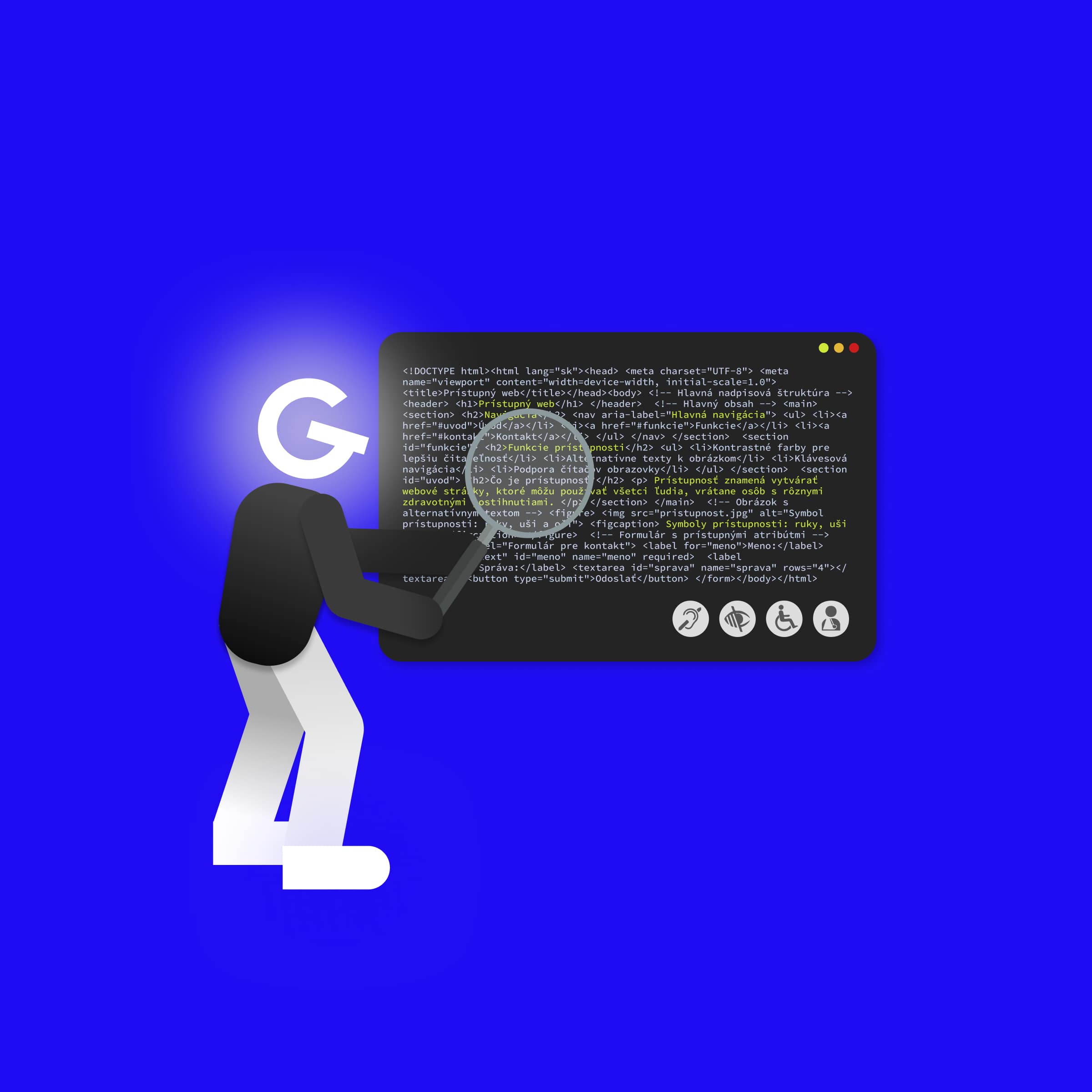
📚 You can find very well-written material on all the rules of the WCAG specification on the website: WCAG in Plain English.
HTML contains a number of tags that semantically describe the content on a website. If we use it correctly, e.g. we use <nav> for navigation, fill in <label> for each input, or write interactive elements as <button>, screen readers will better understand the content and structure of the website.
Tip: Generate semantic HTML using AI (I recommend Gemini PRO)
“Generate accessible HTML without styles from this screenshot”
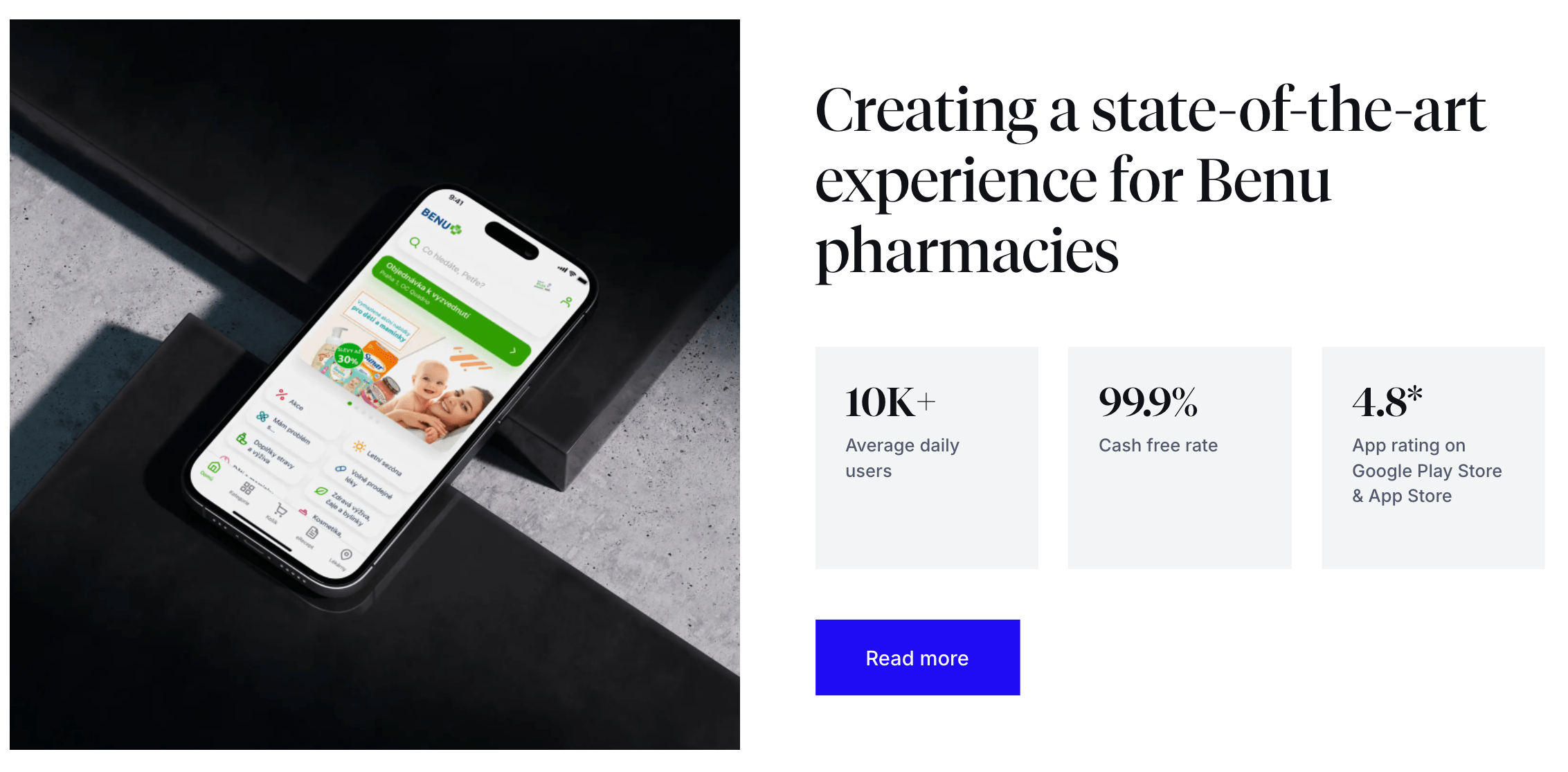
Gemini generated:
<section aria-labelledby="benu-headline">
<div>
<img src="path-to-your-image.png" alt="Benu Pharmacy app displayed on a mobile phone screen.">
</div>
<div>
<h2 id="benu-headline">
Creating a state-of-the-art experience for Benu pharmacies
</h2>
<dl>
<div>
<dt>10K+</dt>
<dd>Average daily users</dd>
</div>
<div>
<dt>99.9%</dt>
<dd>Cash free rate</dd>
</div>
<div>
<dt>4.8*</dt>
<dd>App rating on Google Play Store & App Store</dd>
</div>
</dl>
<a href="/case-study/benu-pharmacies" aria-label="Read more about the Benu pharmacies case study">
Read more
</a>
</div>
</section><section>, <h2>, <dl> dtags gives the content a logical structure.alt attribute of the <img> tag ensures that the information in the image is also accessible to blind people.aria-labelledby helps users of assistive technologies quickly orient themselves to the content of the page.aria-label for links <a> provides a clear description of the link destination, which is crucial for links with generic text such as "Read more".<ul> (unordered list) is good, <dl> (definition list) is even more accurate. It directly communicates the relationship between the value of the metric (<dt>) and its description (<dd>), which assistive technologies can interpret and better present to the user.ℹ️ In addition, semantic HTML helps search engines better understand the content of a page, which also has a significant impact on search engine rankings.
Why it is important to use the correct HTML tags can be demonstrated using the button:
▶️ CodeSandbox example ◀️
<!-- Bad example ❌-->
<div className="button" onClick={handleClick}>
  Open something
</div>

<!-- Good example ✅ (onClick can only be used on focusable elements) -->
<button className="button" onClick={handleClick}>
  Open something
</button>
At first glance, the button works. When I click the mouse handleClick function is called for both div and button. However, if I navigate the website using the keyboard (Tab and Enter combination), div becomes unusable. Browser automatically added the necessary functionality to the native <button> tag, e.g.. tabindex or focus state.
📚 A very well-written article about all HTML tags is available on MDN Web Docs.
ARIA (Accessible Rich Internet Applications) is a set of special attributes that you can add to HTML code. These attributes are used exclusively by assistive technologies and do not affect the rendered content on the web in any way, but only provide additional information for assistive technologies.
⚠️ Use ARIA attributes wisely and only as a last resort if there is no HTML alternative! If you use ARIA attributes incorrectly, you can make your website even less accessible than if you did not use them at all.
<div>, this is navigation or button.“role="navigation", role="dialog", role="button", role="search".<nav> or <button>, automatically add a role, so you need to use the correct HTML tags! The best ARIA is no ARIA.role="tab", role="slider", the role itself does not add any functionality. It only informs the screen reader. Your task is to program keyboard controls, e.g. arrows, Esc, Enter, using JavaScriptu.❌ Bad example: <div role="button" tabindex="0" onclick="myFunkcia()">Save</div>
✅ Good example: <button onclick="myFunkcia()">Save</button>aria-labelledby="id-description" (tells you where to find the text description), aria-required="true" (indicates a required field), aria-invalid="true" (indicates that the value is incorrect).aria-expanded="false" (indicates that the drop-down element is collapsed), aria-hidden="true" (hides element from reader), aria-disabled="true" (indicates that element is inactive).📚 You can find more information about the correct use of ARIA in the MDN documentation.
⚠️ Standard HTML tags usually do not need to implement ARIA attributes, but custom solutions require extra care. We usually use third-party libraries for non-standard functionalities such as dialog, swiper, datepicker, etc. Make sure that these libraries implement ARIA attributes correctly!
Every HTML page must have a unique and descriptive <title> element in the <head> section. Good title is unique, concise, and descriptive. Follow these recommendations:
Specific page name | Website name.lang="sk"). This allows assistive technologies, such as screen readers, to correctly interpret and pronounce the text.lang must also be dynamically adjusted using JavaScript.lang attribute.<!DOCTYPE html>
<html lang="en"> ✅ Filled lang attribute in html tag
<head>
<meta charset="UTF-8">
<title>Custom web design | Company Name</title> ✅ Filled title
</head>
<body>
<h1>Our web design services</h1>
<p>We offer modern and accessible websites...</p>
<blockquote lang="sk"> ✅ If text is in a different language than entire page
<p>Jediný spôsob, ako odvádzať skvelú prácu, je milovať to, čo robíte.</p>
<footer>- Steve Jobs</footer>
</blockquote>
</body>
</html>Not everyone uses a mouse to navigate on the web. Some cannot use a mouse due to illness, experienced users control the web using a keyboard, or we control the web on TV using a remote control... Such users rely on all interactive elements on the web, such as buttons, links, or forms, having their focus state.
You probably would not like it if the cursor did not show up on the website. However, we often do this for users who navigate the website using their keyboard.
body {
  cursor: none; /* you definitely wouldn't do this on the web */
}

:focus {
  outline: none; /*  so please don't do this either */
}
However, :focus has one feature that forces developers to delete the outline. When you click on a button, for example, a frame appears around it, which does not look good. In modern browsers, we can easily solve this problem by using :focus-visible instead of :focus. This selector is already supported by all modern browsers, and thanks to it, the frame is only displayed when navigating with the keyboard (ffocusing on the button using Tab key).
It is necessary to ensure that the focus state is sufficiently visually distinct:
2px thick and must have a contrast ratio of 3:1 (level AAA).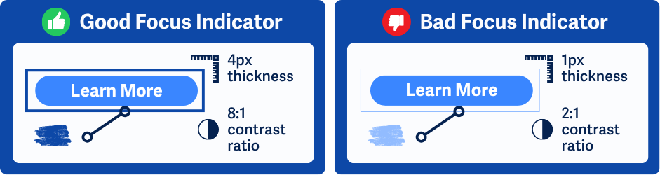
There must be a color contrast ratio of at least 3:1 (level AAA) between the focused and unfocused states.
Focus is at least 2px thick and must have a contrast ratio of 3:1 compared to the unfocused state (level AAA).
// Example of how we can add our own style for the focus state

button:focus-visible {
  outline: 3px solid deepskyblue;
  outline-offset: 3px;
}
Interactive elements, such as buttons, form fields, or links, are tabbable and do not require any additional implementation. If we want to achieve this for <div>, for example, we can assign it <div tabindex="0">. We can use this option, for example, in interactive graphs that do not have a representative tag in HTML. If we want to achieve the opposite effect, i.e. disable interactivity (we cannot select the element using Tab key) we use tabindex="-1". We should not use any other values fo tabindex because they change the order of elements, which is usually not what we want.
Tab order is determined by the order of elements in HTML (DOM), not by the visual layout you create using CSS (e.g. flex-direction: column-reverse or order). Focus order when navigating with the keyboard must be logical and correspond to the visual layout of the page.
On this topic, I recommend reading the article: Indicating focus to improve accessibility.
Purpose of skip links is to allow people to skip repetitive sections or blocks of content on web pages and make it easier for them to access the main content of the page. The most common example is skipping the main navigation. For people who use keyboard navigation, it is frustrating to have to tab through all the links on every page.
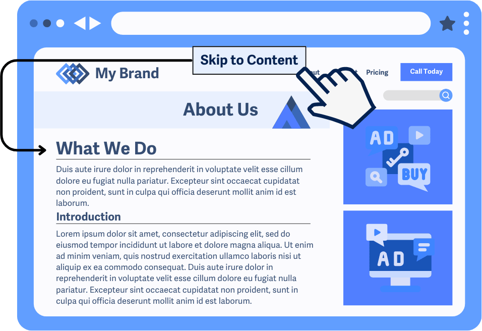
How to properly implement a skip to content link:
<!DOCTYPE html>
<html lang="en">
<head>...</head>
<body>
    <a href="#main-content" class="skip-link">Skip to main content</a>

    <header>
        <nav>
            <a href="/">Home</a>
            <a href="/about-us">About us</a>
            <a href="/contact">Contact</a>
        </nav>
    </header>

    <main id="main-content">
        <h1>Welcome to our website</h1>
        <p>This is the main content that the user accesses after clicking on the link.</p>
        <a href="/example">Next link in content</a>
    </main>
</body>
</html>
.skip-link {
/* Visually hiding a link outside the screen */
position: absolute;
left: -999px;
top: -999px;
/* Style according to the design of the page, e.g... */
padding: 20px;
backround-color: #FFF
color: primary;
font-size: 1.2em;
}
.skip-link:focus {
/* Highlight the link when it receives focus (e.g., with Tab key) */
position: absolute; /* Or 'fixed', as needed */
top: 0px;
left: 0px;
}ℹ️ Get inspired by websites such as smashingmagazine. After loading the page, press
Tabkey.Skip to main contentwill appear in the upper left corner.
⚠️ Do not use Next.js
<Link>component, but use the classic native HTML<a>tag.Linkcomponent incorrectly implements the focus state change. More info in the GitHub issue.
Every interactive element on the page, such as buttons or links, must have a clear name. It often happens that links only contain an icon and no text. This means that screen readers cannot tell blind users what the link is.
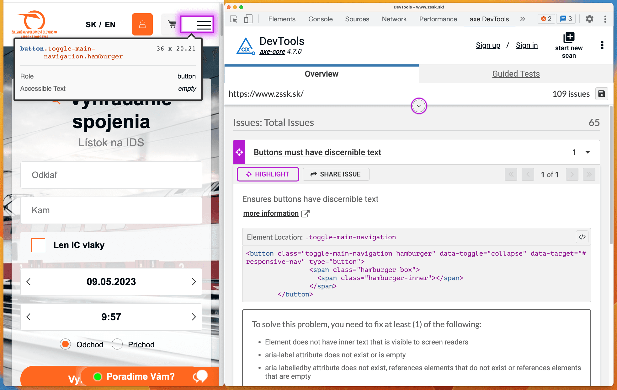
Using the <span> tag, which we hide with CSS but remains visible to screen readers, we can display descriptions for buttons using only svg icons.
// CSS
.sr-only {
  position: absolute;
  left: -10000px;
  top: auto;
  width: 1px;
  height: 1px;
  overflow: hidden;
}
<!-- HTML -->
<a href="https://twitter.com">
<svg aria-hidden="true" ...></svg>
<span class="sr-only">Twitter</span>
</a>We used the aria-hidden="true" attribute for svg element. Icons on the website serve primarily as a visual aid, but they are meaningless to blind people and unnecessarily clutter more important content, such as text in buttons.
📚 You can find more information about methods for hiding visual content on the WebAIM website.

// Bad examples ❌
<button>Facebook</button>
<button>LinkedIn</button>

// Good examples ✅
<button>Share this article on Facebooku</button>
<button>Sshare this article on LinkedIn</button>// Bad examples ❌
<a href="https://www.goodrequest.com/blog">Click here</a>
<a href="https://www.goodrequest.com/blog">Learn more</a>
<button>Edit</button>Ideal solution is to provide meaningful text for this link/button. If this cannot be avoided, we can use a hidden <span> element:
<a href="/blog">
	Show more
	<span class="sr-only">blog articles</span>
</a>

<a href="/blog/{article.url}">
	Read more
	<span class="sr-only">about {article.name}</span>
</a>

<!-- Often buttons in tables -->
<button onClick={handleChangeAddress(user.id)}>
	Edit
	<span class="sr-only">address for user {user.name}</span>
</a>
If you need to completely rewrite the content of the button for a screen reader, you can use aria-label attribute, but make sure that the text in aria-label matches the visible text.
✅ GOOD:
<a href="url" aria-label="Read more about accessibility">Read more</a>
<button aria-label="Send application">Send</button>

❌ BAD (text does not match): <button aria-label="Submit application">Send</button>
📚 You can find more information about the correct description of links in the WCAG specification.
Forms on websites, like other interactive elements, should be accessible using a keyboard. For example, we can move between inputs using Tab key, select should be selectable using the up/down arrows, or checkboxes should be selectable using the space bar.
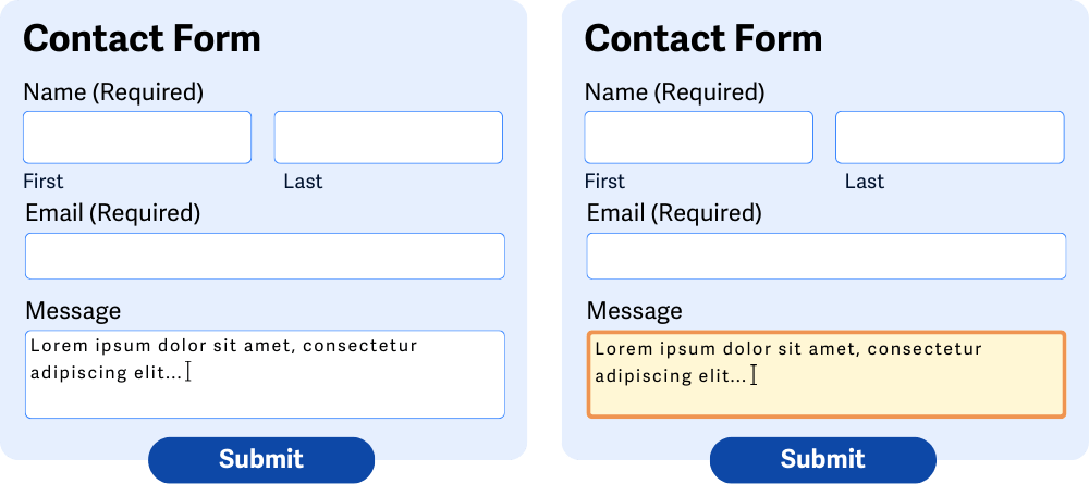
Each input must have a visible <label> element assigned to it. We can use two notations using the for attribute in combination with id or wrapping the input in a <label> element.
<label for="name">Name:</label>
<input id="name" type="text" autocomplete="name">

<!-- or -->

<label>Name: <input type="text" autocomplete="name"></label>Checkboxes or radio inputs can be grouped using <fieldset> element and assigned a description using <legend> element. However, visually grouping inputs is not sufficient for people who use screen readers.
<fieldset>
  <legend>Select your pizza toppings:</legend>
  <input id="ham" type="checkbox" name="toppings" value="ham">
  <label for="ham">Ham</label><br>
  <input id="mushrooms" type="checkbox" name="toppings" value="mushrooms">
  <label for="mushrooms">Mushrooms</label><br>
  <input id="olives" type="checkbox" name="toppings" value="olives">
  <label for="olives">Olives</label>
</fieldset>required or aria-required="true". Marking it with an asterisk is not enough, because not all screen readers recognize that it is a mandatory input.<input id="name" type="text" required>
<!-- or -->
<input id="name" type="text" aria-required="true">aria-invalid="true" attribute is used for this purpose, thanks to which the screen reader notifies the user of the error.<input id="name" type="text" aria-invalid="true">aria-describedby. The value of aria-describedby is id of the element that contains the error message. Screen readers will then read the field label, its type, value, and then the error message.<label for="userEmail">E-mail:</label>
<input aria-describedby="emailError" aria-invalid="true" id="userEmail" type="email" name="email">
<div id="emailError" class="error-message">
Please enter a valid email address.
</div>📚 You can find well-written material on form accessibility at WebAIM.
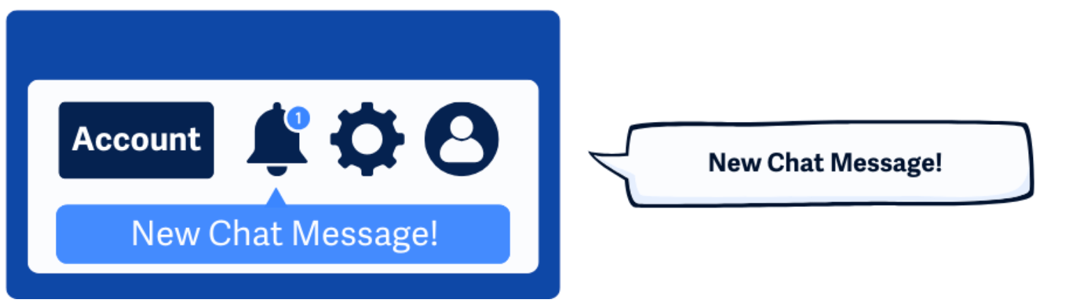
On the web, some actions do not cause the page to reload completely. User can:
Sighted user perceives these changes visually. However, a screen reader user does not know that something has happened.
<!-- automatically adds aria-live="polite" and aria-atomic="true" -->
<div role="status"> {{announcementString}} </div>

<!-- automatically adds aria-live="assertive" and aria-atomic="true" -->
<div role="alert"> {{announcementString}} </div>
For regular (non-urgent) reports: role="status"
Reader reads the message when it is not announcing other content (it is idle). This is the option for 95% of cases.
For urgent reports: role="alert"
For critical errors or time-sensitive warnings that require immediate user attention, warning is announced immediately and does not wait until the screen reader is idle.
aria-live:"polite": Notify change when nothing else is happening."assertive": Will immediately interrupt the user and notify them of the change.aria-atomic:"true": Reads the entire content of the element."false": Will only read the changed part.<div aria-live="polite" and aria-atomic="true"></div> <!-- same as role="status" -->
<div aria-live="assertive" and aria-atomic="true"></div> <!-- same as role="alert" -->Further examples of how to use aria-live and aria-atomic:
<!-- aria-atomic="false", because we only want to report new messages -->
<div id="chat-log" aria-live="polite" aria-atomic="false">
  <p>Jane Doe: Hi everyone!</p>
  <p>John Smith: Hello there!</p>
</div>

<ul id="live-scores" aria-live="polite" aria-atomic="false">
  <li>Team A vs. Team B: 1-0</li>
  <li>Goal! Team A scores. The score is now 2-0.</li>
</ul>

<!-- aria-atomic="true", because we want to report the entire text and not just the changes -->
<div id="search-summary" aria-live="polite" aria-atomic="true">
  Showing 15 of 240 products.
</div>

<div id="stepper-status" aria-live="polite" aria-atomic="true">
  Step 2 of 5: Shipping Details
</div>

<div id="toast-notification" aria-live="polite" aria-atomic="true">
  File saved successfully.
</div>


<!-- aria-live="assertive", because we want to report a critical error -->
<div aria-live="assertive" aria-atomic="true">
  An unknown error occurred while saving your changes. Try again.
</div>

<div aria-live="assertive" aria-atomic="true">
  Connection to server lost. Your changes may not be saved.
</div>
Example of how to make accessible search:
function AccessibleSearch() {
  const [searchStatusMessage, setSearchStatusMessage] = useState('');

  const handleSearch = (searchTerm: string) => {
    // Search logic here
    setSearchStatusMessage(`${resultsCount} results found for ${searchTerm}`)
  };

  return (
    <>
      {/* 1. Use a form with role="search" for a landmark */}
      <form role="search" onSubmit={handleSearch}>
        {/* 2. Connect the label to the input */}
        <label htmlFor="search-input">Search our site</label>
        <input
          type="search"
          value={searchTerm}
          onChange={(e) => setSearchTerm(e.target.value)}
        />
        <button type="submit">Search</button>
      </form>

      {/* 3. ARIA live region to announce status updates */}
      <ScreenReaderOnlySC role="status">{searchStatusMessage}</ScreenReaderOnlySC>
    </>
  );
}
ℹ️ Mantine notifications implement ARIA Live Regions and correctly report the content of notifications to screen readers.
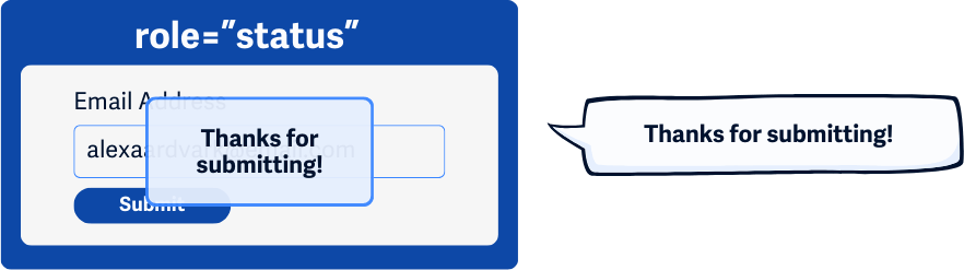
Errors must be clearly marked and described to the user. If the user makes a mistake when filling out a web form, all errors they have made must be clearly identifiable. The error message should state exactly what went wrong and how to fix it.
Some examples of useful error messages:
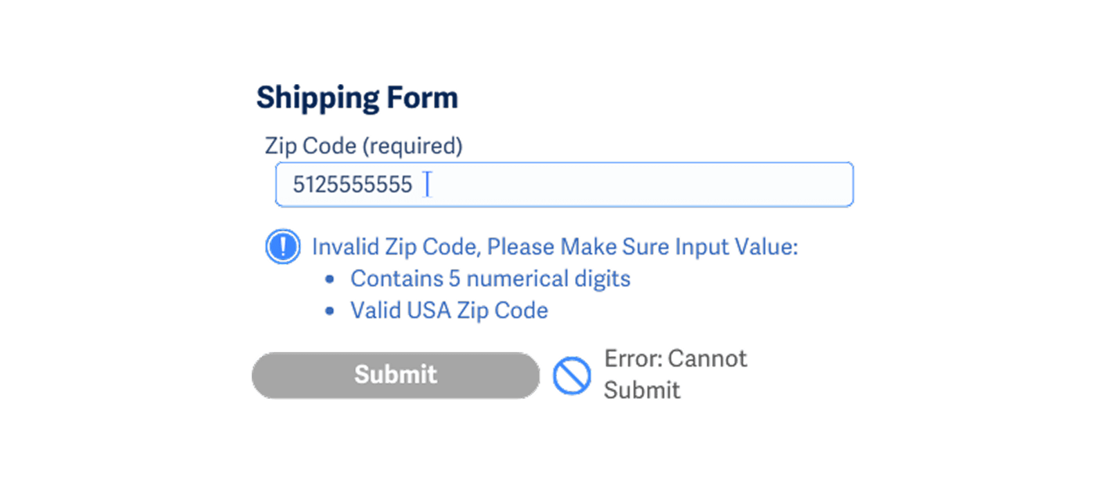
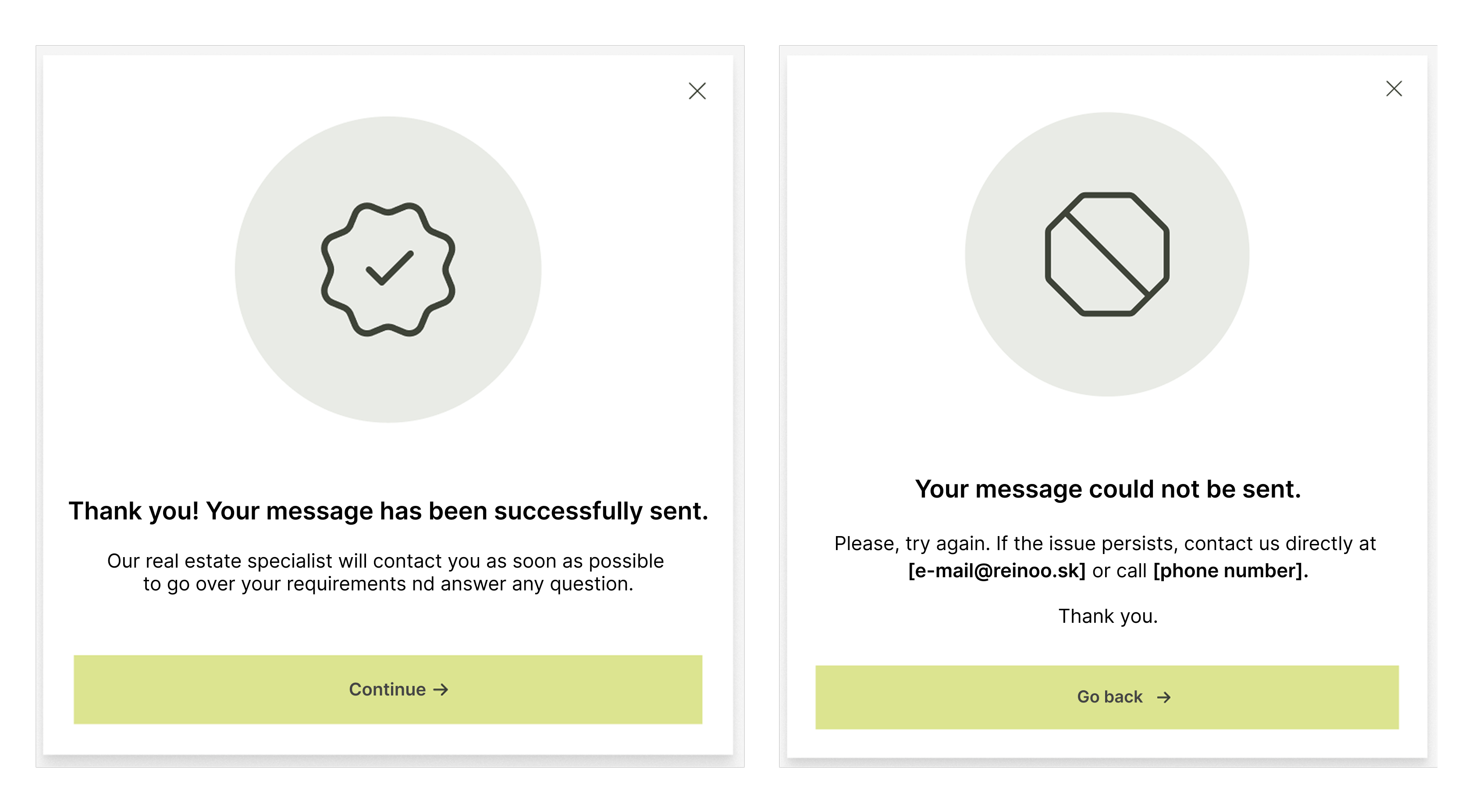
Providing clear feedback after successful form submission gives users confirmation that they do not need to search through the form or page for errors. By displaying clear and consistent feedback, users can quickly understand that their action has been completed.
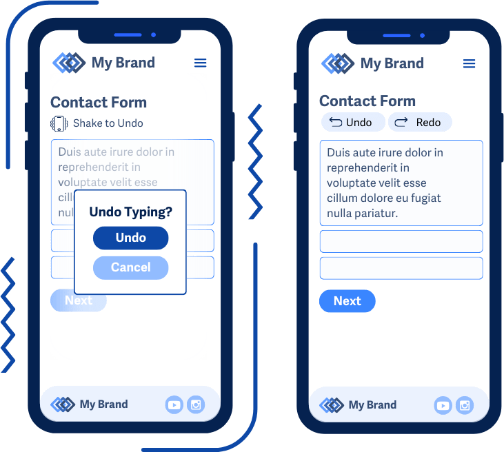
Any action that requires a complex gesture (swiping, pinch-to-zoom, dragging, shaking, tilting) must also be possible with a simple action, such as clicking a button or pressing a key. No function should rely solely on motion gestures. Motion control can be a supplement, but never the only way to do something.
Examples:
Next and Back arrows..+ and - buttons.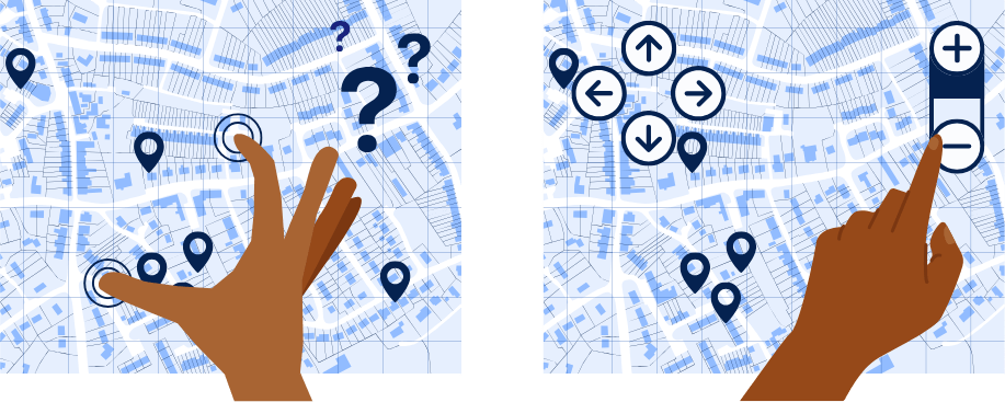
Map on the left relies solely on gesture controls (pinch to zoom and swipe). The map on the right displays proper zoom buttons and navigation arrows, which help users understand how to control the content even without using pointing gestures.