Design6 Mins reading
Good typography is invisible: how to improve readability
Aneta Stašiková1 Jun 2022
Visual accessibility is the foundation of a website that can serve everyone. From readable text to sufficient contrast to clear navigation, every detail matters. Clearly defined principles help maintain consistency and ensure a fair user experience.

Visual accessibility refers to the ability of a website to communicate information to every user, regardless of their abilities or technical limitations. For developers, this means looking at colors, contrast, typography, and interactive elements not only from an aesthetic perspective, but also from a usability and readability perspective.
The design has to be flexible and let users zoom in up to 200% without losing content or functionality. Content should adapt smoothly to the screen width to avoid horizontal scrolling (except for large tables, maps, or other two-dimensional layouts). We support a minimum display width of 320px.
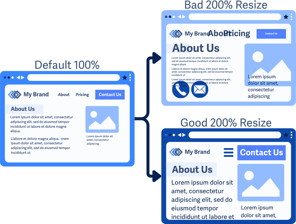
Incorrect example of 200% magnification: This example uses a combination of relative and absolute units. Its layout appears broken, text overlaps, elements extend beyond the screen, and part of the text remains the same size and is unreadable. Correct example of 200% magnification: This example is readable and well organized, with all content magnified by a factor of two.
You can achieve this by specifying font sizes, container sizes, and element positions using relative units such as rem, em, %, vw or vh. Avoid using absolute units such as pixels (px), pri špecifikovaní štýlovania prvkov a rozloženia.when specifying element styling and layout. Users can also increase letter-spacing, word-spacing, line-height and paragraph spacing without cropping content or disrupting functionality.
// Bad examples ❌
font-size: 16px;
line-height: 8px;
@media (min-width: 800px) {}

// Good examples ✅

// If we set zoom to 200%, website will be rendered as on a mobile device (e.g., menu will be hidden).
@media (min-width: 50rem) {}
font-size: 1rem;
line-height: 1.5;For more information on the proper use of relative units and
pxsee article: The Surprising Truth About Pixels and Accessibility.
Using rem values is great when it comes to typography. However, when we use rem values for horizontal indentation, we reduce the amount of usable space, further limiting the number of words that fit on a line (see comparison):
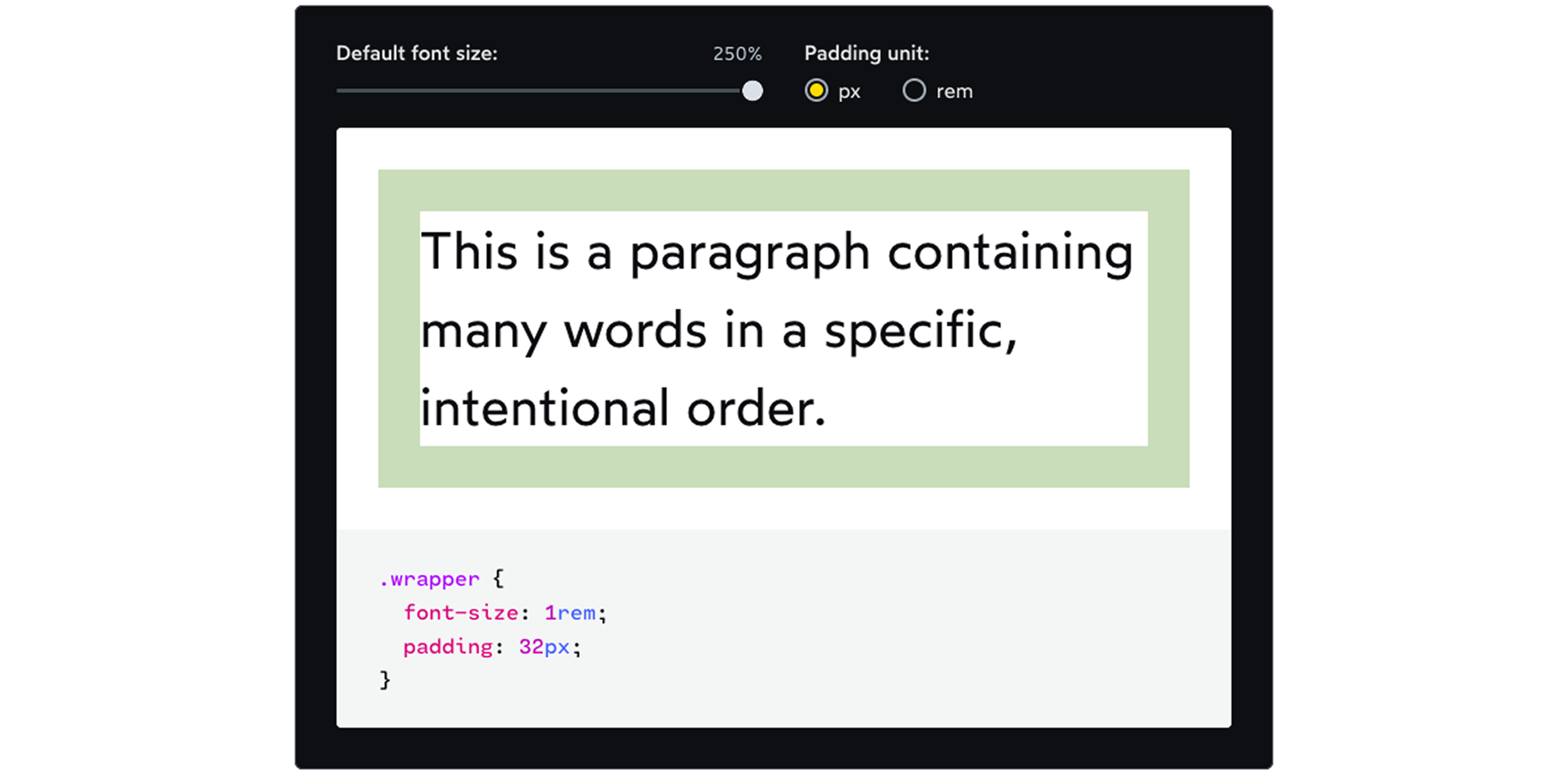
Padding in px values. Space for text remained the same.
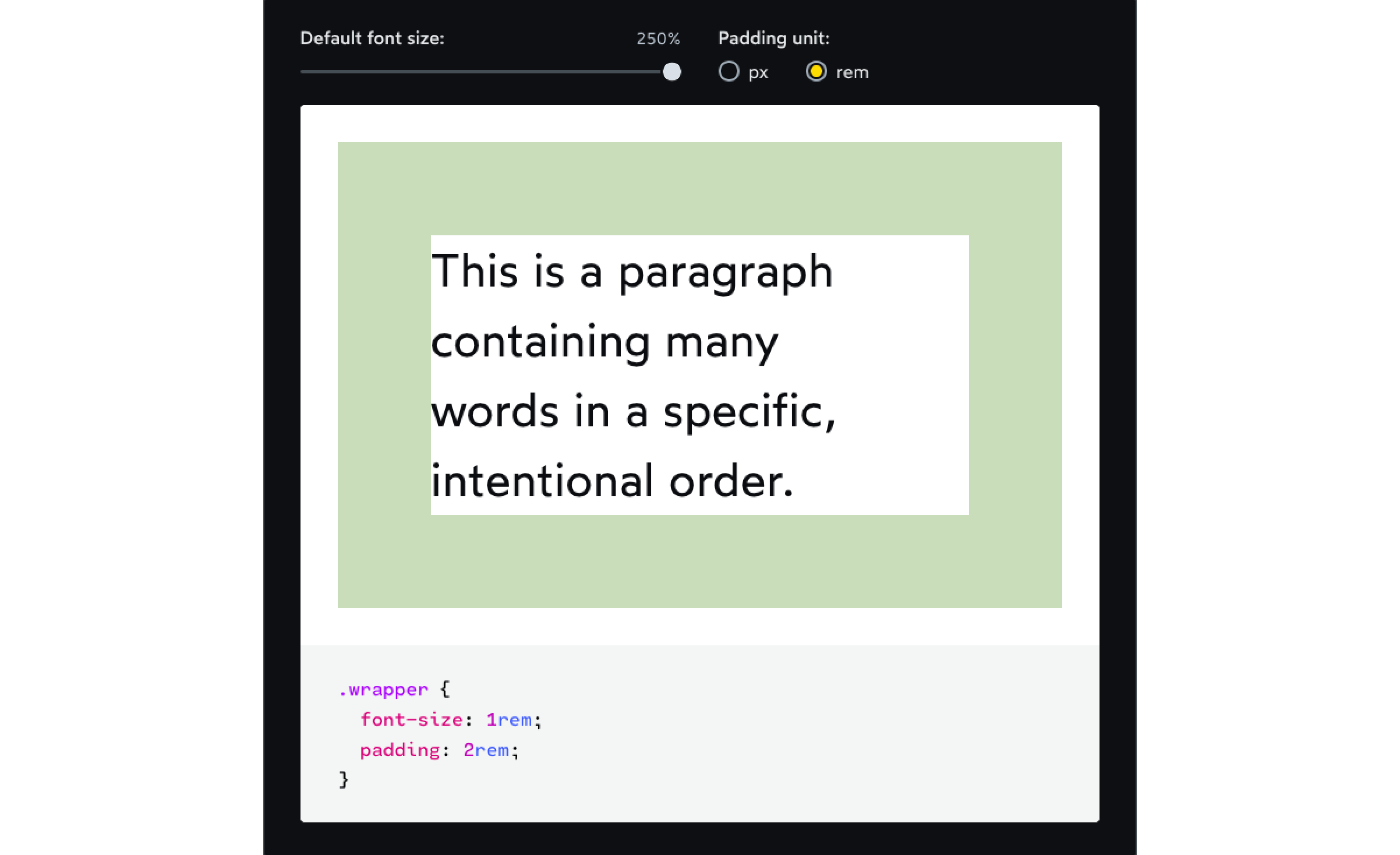
Padding in rem values. We have limited space for text.
Therefore, it does not make sense to use rem values for border-width either. When choosing between pixels and rem, you should ask yourself this question:
🤔 Should this value increase when the user increases the default font size in the browser?
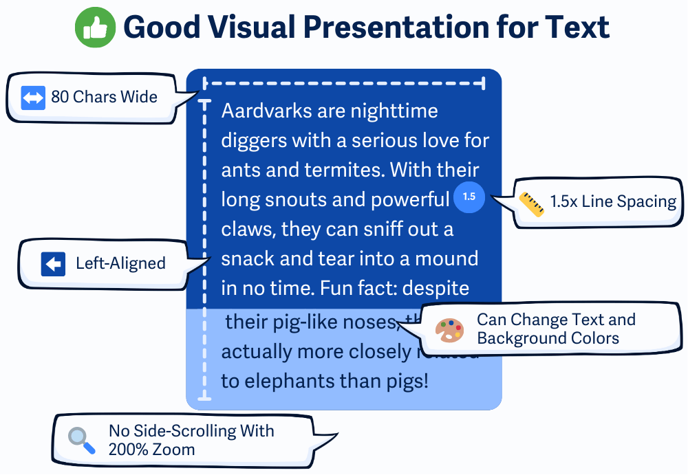
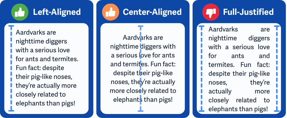
For blocks of text, avoid centering or justified alignment, set the line height to at least 1.5, and do not exceed 80 characters per line. Users must be able to set the text and background color. People with dyslexia or other learning disabilities often benefit from shorter lines, larger line height, and simple text aligned to the left.
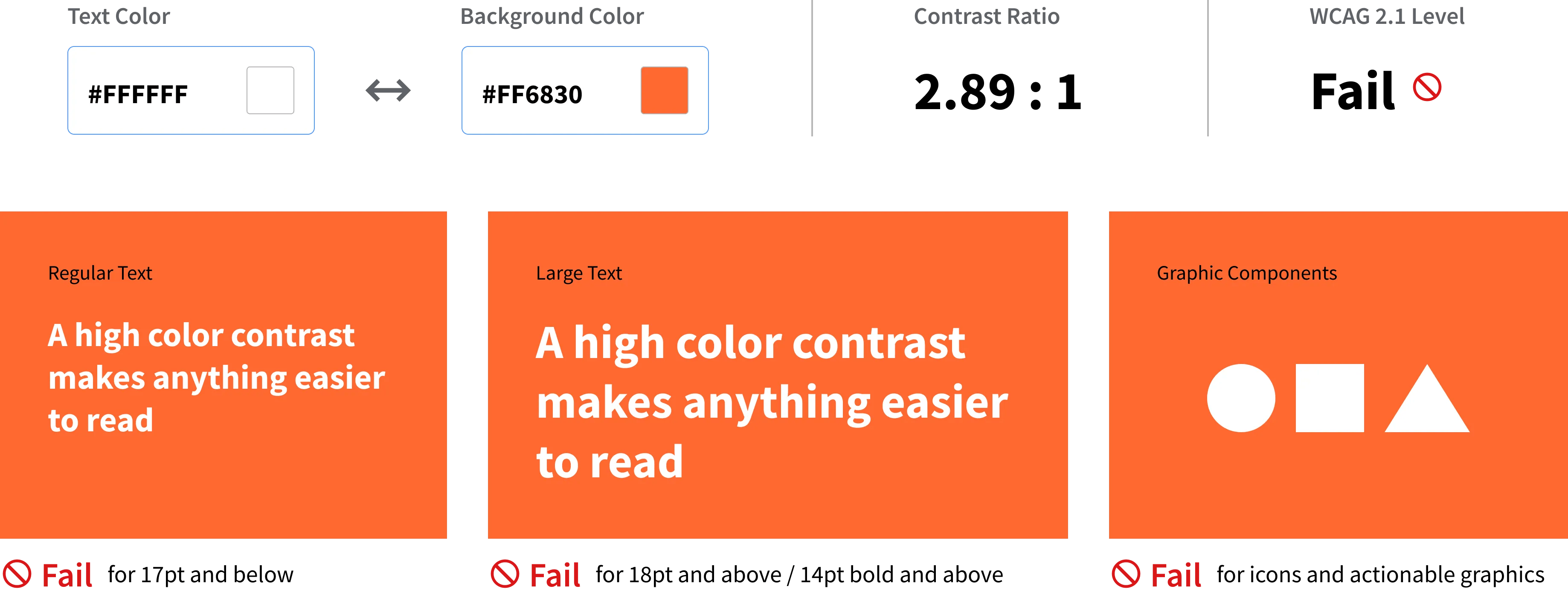
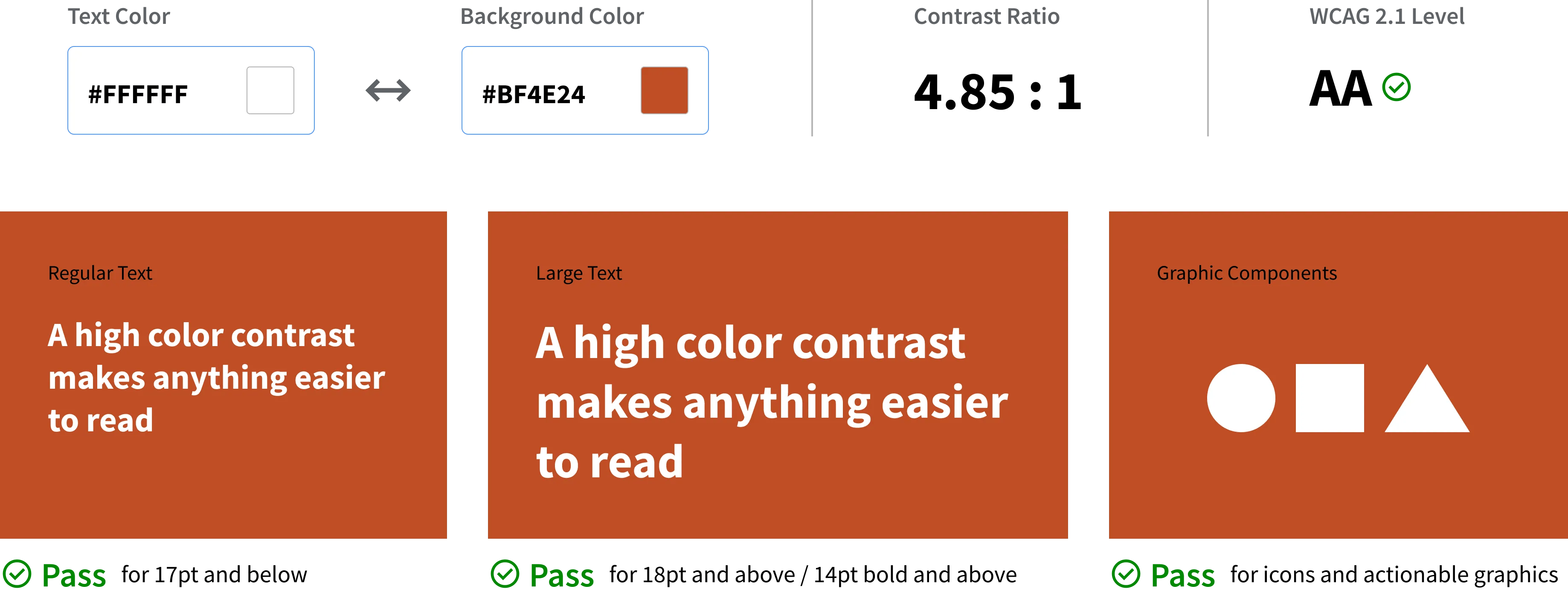
Text on the web must have sufficient contrast against the background so that it can be read by all users, including those with visual impairments or color blindness, for whom low contrast can cause text to disappear completely into the background. Use the contrast checker tools in Figma or your browser's DevTools to verify that you meet the required ratios.
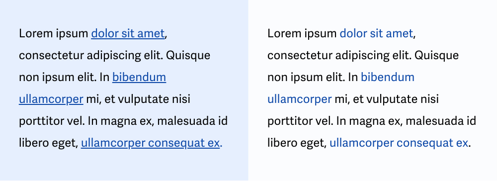
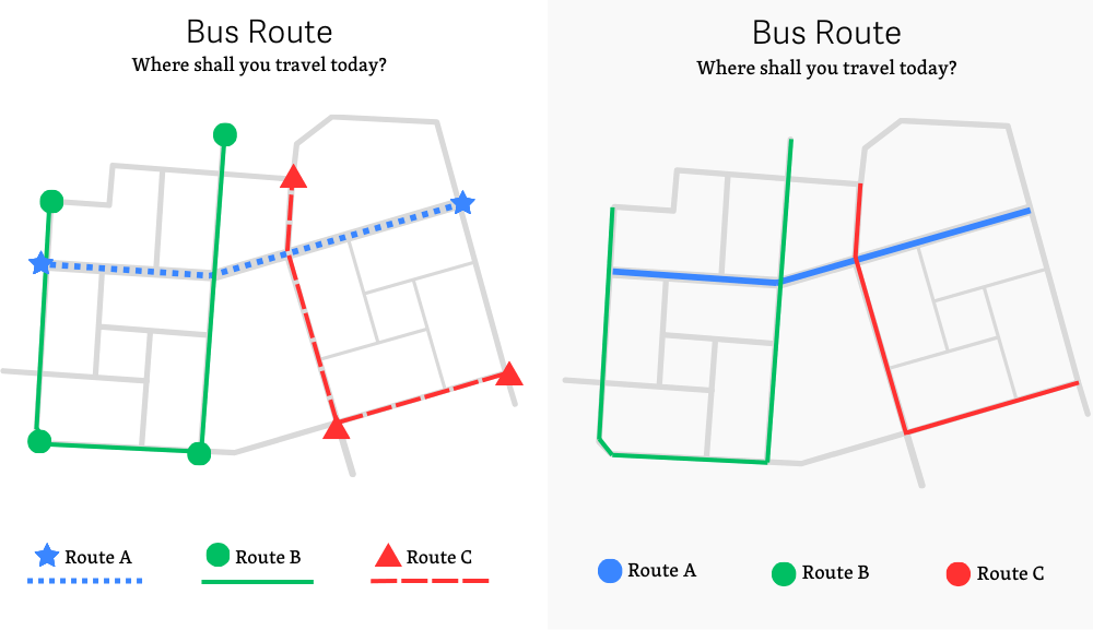
Do not use color as the only visual aid. Information, actions, calls to action, or visual distinctions must not be conveyed solely by color. The design should also include other visual indicators such as icons, underlining, bold font, or different shapes. For color-blind, visually impaired, or blind users who use a screen reader, there must be another way to convey the information.
Accessibility isn't just about design. Check out this handy checklist that shows you how to write HTML and CSS to make your website readable, usable, and fair for everyone 👇
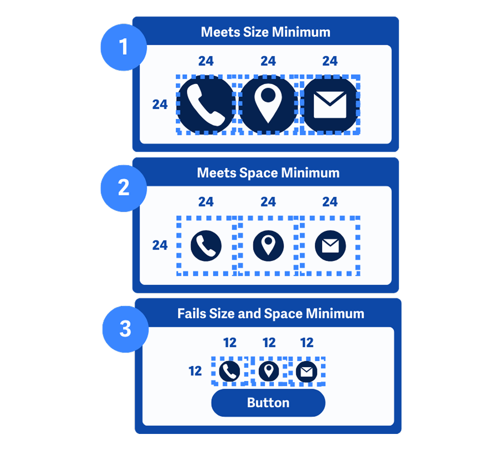
Buttons, links, and other interactive elements on the website should have a minimum size of 24 x 24 pixels (for important content, a minimum size of 48 x 48 pixels is recommended). If this is not possible, they must have sufficient empty space around them to prevent accidental clicks. Small and crowded elements are frustrating to click, especially on touch screens for people with:
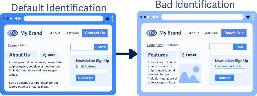
Users expect features such as menus, search, skip content buttons, or contact menus to remain in the same place when they visit different subpages of a website.
Predictable website layout makes life easier for everyone. When users always know where to find key navigation elements, they do not waste time searching. Maintaining consistency is not just useful, it is essential.
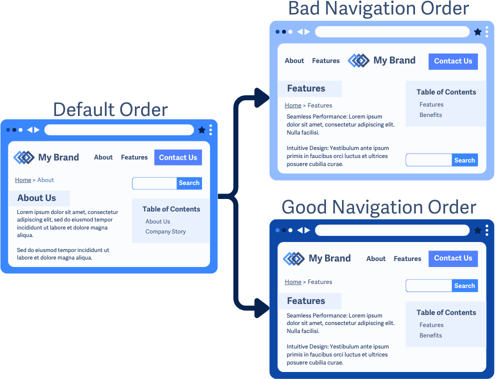
Interactive elements such as buttons, links, and form controls are labeled consistently throughout the website. If something performs the same action on multiple pages, it should always be identified in the same way.
Blind people rely on screen readers when interacting with websites. If a button on one page says "Add to cart" and on another "Buy now," they have to figure out if it performs the same function, which requires unnecessary effort.
Interactive components that are commonly duplicated on websites include:
Non-text content is anything on a website other than text, such as images, graphs, video, audio, and other visual and audio content. Text alternatives help make non-text content accessible to blind or deaf people.
ℹ️ Search engines such as Google or AI (Gemini) understand the content of a page better thanks to alternative texts, so by filling in alternative texts correctly, you improve SEO.
Rules for writing alternative texts for images:
<img>). Adding this to the alt text s unnecessary and distracting.alt text should describe where the user will be taken (e.g., "Home page of company XY").alt attribute: If an image is not used to convey information, but only for visual enhancement (e.g., various wavy lines, backgrounds), it must have alt="". This signals the reader to ignore it. Do not omit the alt attribute entirely!// Good examples ✅
<!-- It is concise, to the point, and accurately describes the main idea of the image. -->
<img alt="A golden retriever plays with a red ball in the park.">
<!-- If the data is simple and concise, you can insert it directly into the alt text. -->
<img alt="Bar chart of visits: April - 5,000, May - 8,000, June - 12,000 visits.">
<!-- It clearly communicates that clicking on the logo will return the user to the home page. It describes the function, not just what is in the image. -->
<img src="logo_GR.png" alt="GoodRequest - home page">
// Bad examples ❌
<!-- Too general. Does not provide any useful information. -->
<img alt="a dog">
<!-- Unnecessarily long and begins with the word "Photo." Details about the weather or the color of the grass are apparently not relevant to the context of the article. -->
<img alt="Photo of a golden retriever playing with a red ball on green grass in a park on a sunny day.">
<!-- Does not describe the function of the link. User does not know where clicking on it will take them. -->
<img alt="Logo">
<!-- Better, but information about the link destination is still missing. -->
<img alt="WebTech company logo">
<!-- Unnecessarily interrupts the user with information that has no value to them -->
<img alt="Blue wavy line">
<!-- User does not learn anything from the data displayed in the graph. It is the same as if there were no image there. -->
<img alt="Visitor graph">Rules for writing alternative texts for other types of content:
Static images with text content do not allow people to change the appearance of the text to improve its readability, e.g. color contrast, text size, etc. Text in images is blurred when zoomed in. Unlike real text on a page, text in an image does not adapt to different screen sizes or user settings.
Screen readers cannot interpret text within images, so people who rely on these tools will not be able to access the content unless the image is properly labeled or contains alternative text.
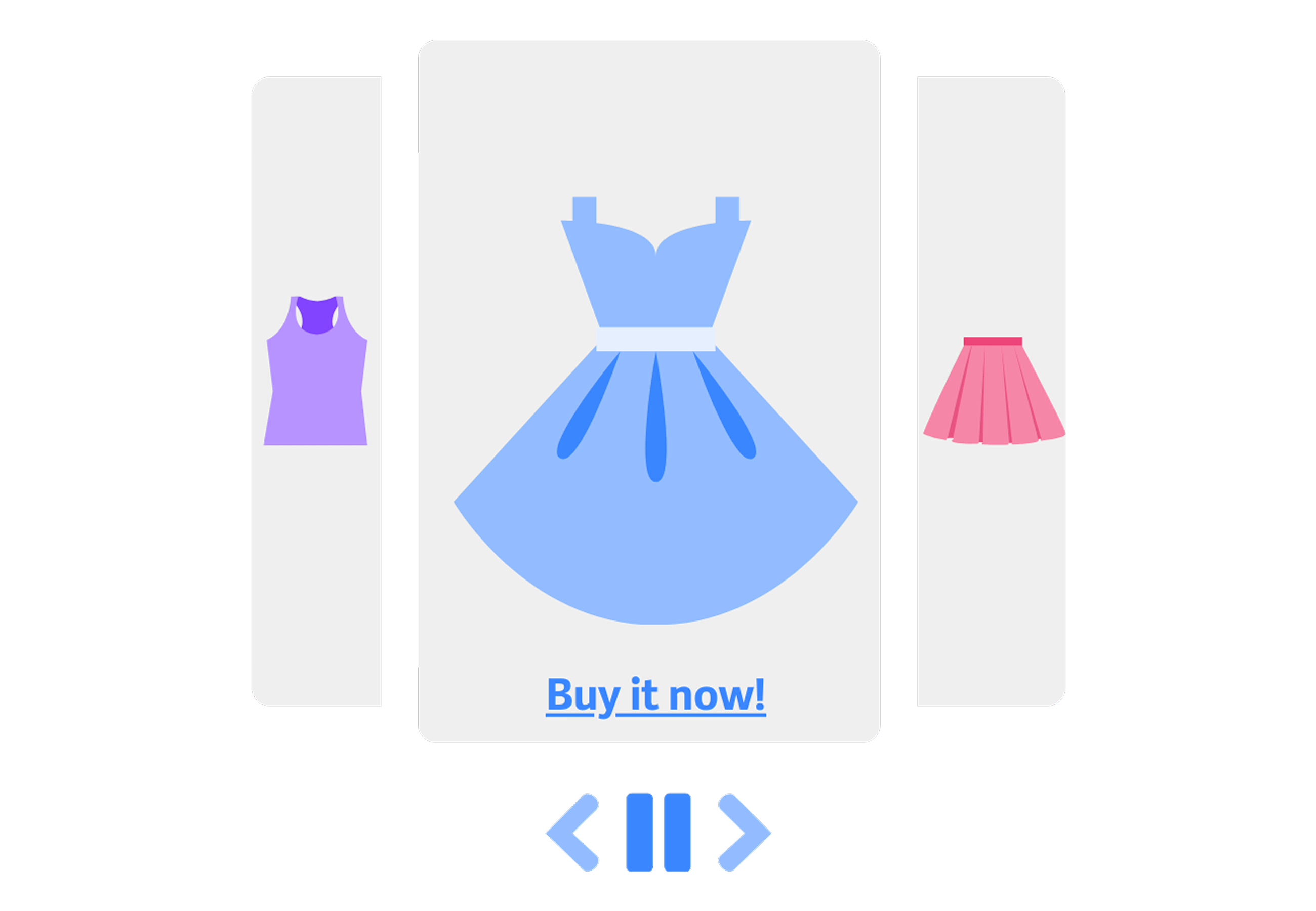
Automatically moving or animated content that lasts longer than 5 seconds must be able to be paused or hidden. Elements that automatically update cause problems for screen reader users or people who are unable to process information quickly (cognitive disabilities).

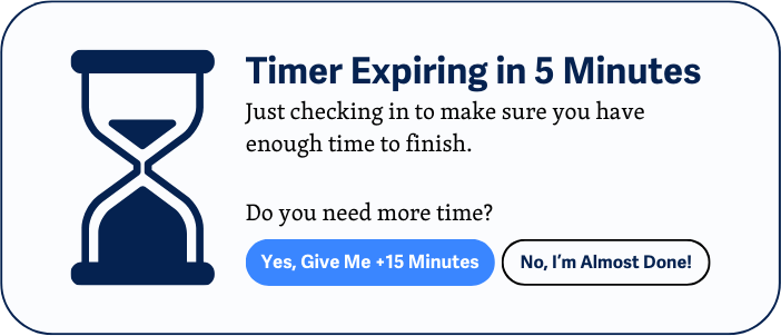
Time limits should be avoided unless they are necessary for the task at hand (e.g., exams, auctions). If time limits are used, it must be possible to disable them, adjust them to at least 10 times the default value, or extend them by at least 10 times.
Nothing on the page should flash more than three times per second. It does not matter how large or bright the content is. Some web content, such as videos, games, or animated graphics, may flash rapidly to attract attention. However, this type of flashing can cause seizures or other serious health problems in users who are sensitive to flashing content.
I need more time (extend by 10 minutes).