
Frontend
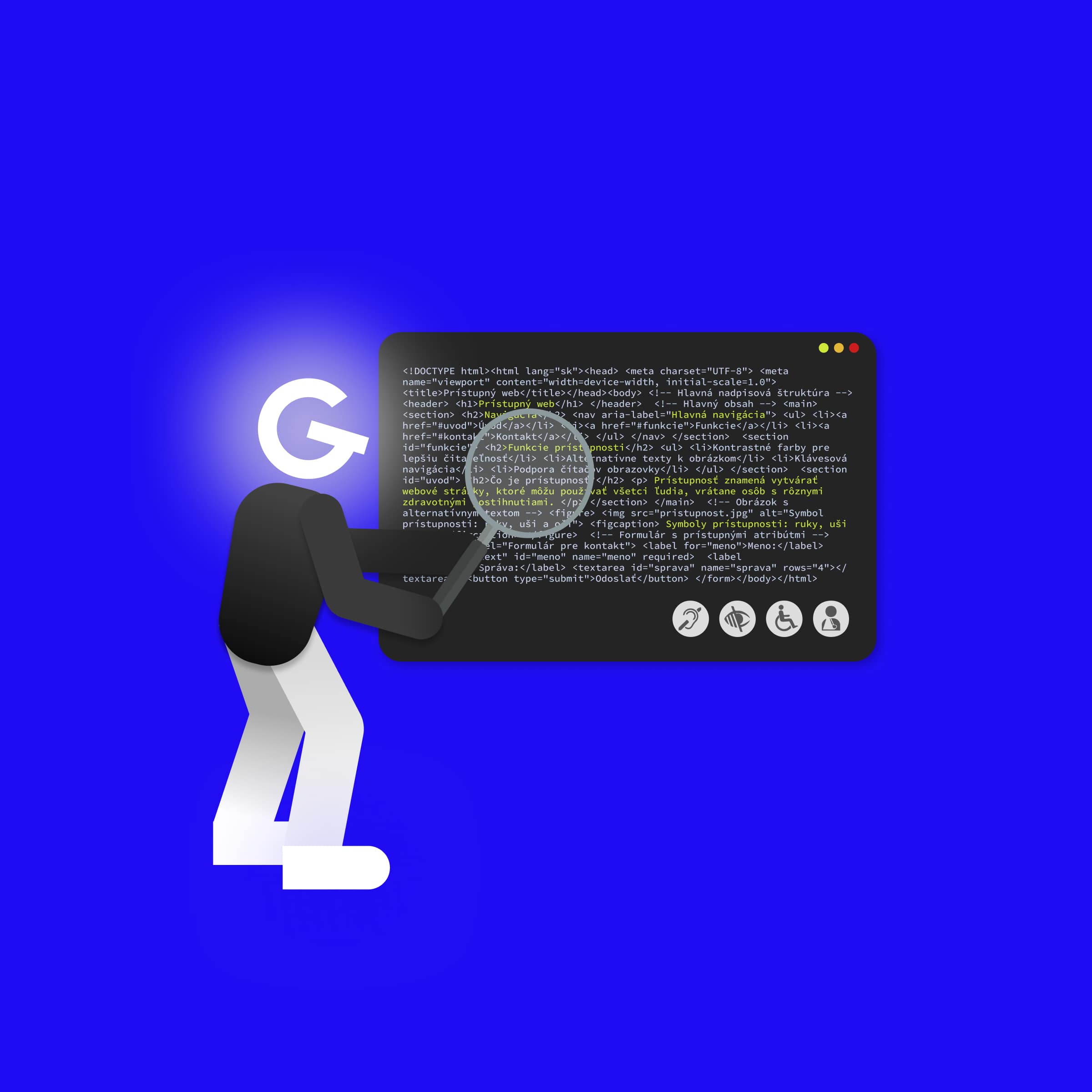
What is accessibility and how to make your web accessible
Andrej Nemeček17 May 2022
In this article, we present the other 5 most common mistakes that are often repeated on websites and how to easily fix them. Just by fixing these few problems, we can significantly improve accessibility on the web.

To begin with, I recommend that you also take a look at our article with an introduction to accessibility, in which you will read everything you need to understand the basics.
Not everyone uses a mouse to navigate the web. Some cannot use a mouse due to illness, experienced users control the web using a keyboard or we control the web on TV via a remote control... Such users rely on the fact that all interactive elements on the web, e.g. buttons, links or forms have their own focus state.
You probably wouldn't like it if you didn't see the cursor on the web. However, we often do this for users who navigate the web using a keyboard.
body {
  cursor: none; /* you certainly wouldn't do this on the web */
}

:focus {
  outline: none; /* so, please don't do this either */
}
However, :focus has one feature that forces developers to remove the outline. When clicking with the mouse, e.g. the button has a frame around it, which doesn't look good. In modern browsers, we can easily solve this problem if we use :focus-visible instead of :focus. This selector is already supported by all modern browsers, and thanks to it, the frame is only displayed when navigating using the keyboard (we focus on the button via the Tab key).
We usually want a custom style for the focus state that fits our design better. Then we can override the default style of the browser, but we must be careful that it is visually distinct enough.
// Example how we can add our own style for focus state
button:focus-visible {
  outline: 3px solid deepskyblue;
  outline-offset: 3px;
}
An example of how to make a focus state that is functional and also looks good on the website https://www.smashingmagazine.com.
Interactive elements such as button, form fields or links are tabable and do not need to implement anything additionally. If we want to achieve this, e.g. for <div> we can assign it <div tabindex=”0”>. We can use such an option, e.g. in interactive charts that do not have a representing tag in HTML. If we want to achieve the opposite effect, i.e. turn off interactivity (we cannot mark an element with the Tab key), we use tabindex="-1". We should not use any other values for tabindex, because they change the order of the elements, which we usually do not want.
ℹ️ Regarding this topic, I recommend also looking at the article Indicating focus to improve accessibility, which goes into more detail.
HTML contains a number of tags that semantically describe the content on the web. If we use it correctly, e.g. we use <nav> for navigation, fill each input with <label> or write interactive elements as <button>, so screen readers will better understand the content and structure of the website.
ℹ️ ️ ️ In addition, semantic HTML helps search engines to better understand the content of the page, which also has a significant impact on the position in search engines.
Why it is important to use the correct HTML tags can be seen on the button:
// Bad example
<div className="button" onClick={handleClick}>
  Open something
</div>

// Good example
<button className="button" onClick={handleClick}>
  Open something
</button>
At first glance, the button works. When I click the mouse, the handleClick function is called just like for the div and for the button. However, if I navigate the website using the keyboard (a combination of Tab and Enter), the div becomes unusable. The browser automatically added the necessary functionality to the native <button> tag, e.g. tabindex or focus state.
ℹ️ A very well prepared material on all HTML tags is on MDN Web Docs.
In order for the website to be accessible, according to the WCAG specification, the user can zoom in on the website by at least 200% without limiting the functionality of the page. The user-scalable="no" parameter in <meta name="viewport"> disables zooming of web content. Similarly, the maximum-scale=1 parameter limits the extent to which the user can zoom in on the content. Therefore, these two parameters are limiting for visually impaired users for whom zooming in on content is key.
// Never forbid a zoom
<meta name="viewport" content="width=device-width, initial-scale=1, maximum-scale=1">
<meta name="viewport" content="width=device-width, user-scalable=no">

// This is the right way
<meta name="viewport" content="width=device-width, initial-scale=1" />
Developers are often faced with the dilemma of whether to use px or rem/em units. Pixels still have a place in CSS and there are situations when it is better (also from the point of view of accessibility) to use px. But where we definitely want to use rem or em instead of pixels is typography. Thanks to this, the user can adjust the font size in the browser settings. If we use px , we will take this option away from the user.

The user can adjust the basic font size in the browser settings
ℹ️ Excellent material about when to use rem or px can be found in the article: The Surprising Truth About Pixels and Accessibility
On the web, we often use more advanced components, e.g. modal, datepicker, etc. Usually, for such components, we reach for an existing UI framework such as e.g. MUI, Ant Design or Radix UI. Therefore, it is important to check whether it supports accessibility when choosing a UI library. We often find a section on accessibility in the documentation, which I definitely recommend to always read. Usually there you will find tips on how to make the component accessible.

Section on accessibility to the input component in the MUI library.
If we want to create our own component, we have to think about a lot of details. On the W3.org website you will find procedures on how to implement frequently used components. That's why it's sometimes more appropriate to choose a UI library that will solve it for us. Just coding your own modal may not be as easy as it might seem at first glance:
Escape closes the modaldialog, aria-labelledby refers to the title of the modal and aria-describedby refers to the content that describes the meaning of the modal.On our projects, we started using the Radix UI library, which handles accessibility and most of the functionality for us, and at the same time allows us to style the component as needed.
These few tips can significantly improve accessibility and, in addition, improve SEO and website quality. You can find more tips on how to improve accessibility in our first article.