
Insight • Business
Webinar: AI Content as a Double-Edged Sword
GoodRequest4 Jun 2026
GoodRequest was established in 2013. In 8 years you have had the opportunity to see it in two brands. Today we are launching the third one. A brand with a clear goal to reflect on the growth and changes that the company is going through, a mature, serious but "fresh" identity.

The need for a new brand arose not only to underline the growth and changes that the GR underwent, but mainly to solve the implementation and consistency issues we faced. The last redesign in 2017 brought a new logo and a change in communication, but it did not provide a solid foundation for the creation of various types of content. We lacked barriers, consistency and implementation rules. The interpretation of the ".gr" logo created the assumption that we are a Greek company :)

The challenge, therefore, was to create not only a new brand but a comprehensive identity with a solid system and rules.
For us, brand means two main components: Who we are, towards the inside of the company, and how we communicate it to the outside. If we wanted to build a brand on solid foundations, we had to answer basic questions - What is GoodReuqest? Where is it going? What do we believe in? What kind of world do we want to strive for?

We are GoodRequest. Our vision is to create a meaningful and responsible digital world. We help ambitious companies create breakthrough digital solutions that bring value and move society forward. We care about the impact that the products we create have on people and society. People are the foundation of everything we do. People are GoodRequest.
We decided to build our new brand on these foundations.
Claim that GR is a "young and small company" is not true anymore. In 8 years, we have grown from 8 to 80 people. We create top products for the biggest players. However, this does not mean that we are big and dull :) GoodRequest is an ideal ratio between professionalism and progressiveness. The vision of the new brand was therefore clear - to create a "Serious but fresh brand" that will communicate it clearly.
Main brand ideas:

For years, we have been trying to combine design and technology into products that bring value to people. Within the brand, we tried to find the point where people and technology meet.

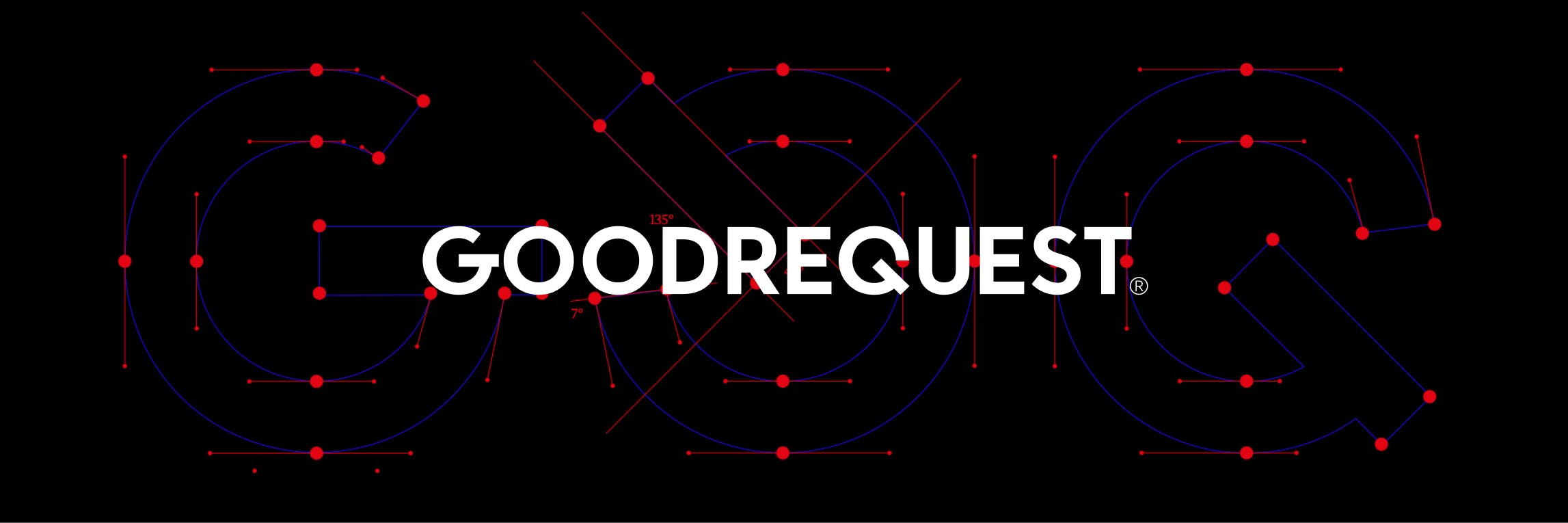
This point is the potentiometer. The element by which the human hand controls technology since time immemorial. From the guitar, DJ desk, car or radio - we can find it everywhere. This symbol is represented in different variations the different phases in which people, design and technology enter the process. Tuned to the ideal ratio. An update of our new logo and pictogram is also based on this symbol.

We have added other colors from the spectrum to our "historic" blue and black. Glowing yellow - pear and gray with a touch of blue - cloudy.

We chose a serif font that has its origins in handwriting - Tiempos Fine.

The GoBigname studio helped us with our identity. We spent a lot of hours and rounds of feedback on the brand together. We are currently refining the details and setting up communication and rules for content types. We are gradually updating our website and all materials.

You can gradually notice the changes on our social networks or blog. Gradually, we will reveal other interesting facts from the process of creation and behind the scenes of the creation or internal launch.


